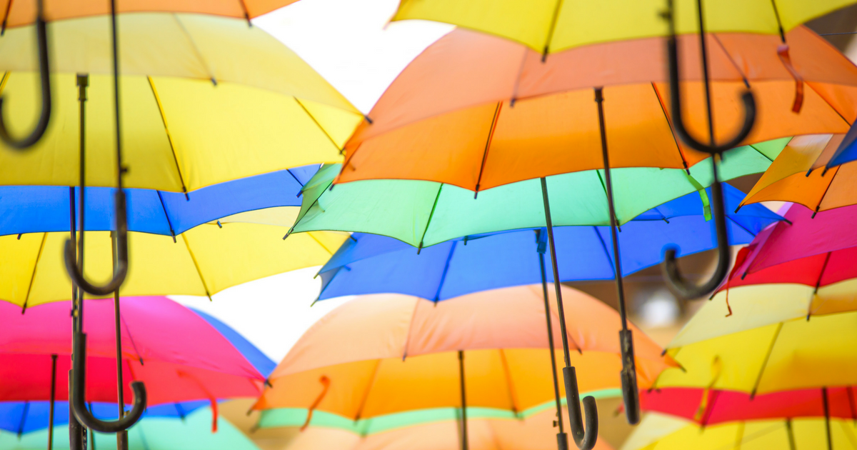
Next time you decide that you’re debating on color – anything from buying an umbrella to changing the color of a room – consider the implications of “color mood.” This is the psychological effects of certain colors on your attitude or mood – it’s a real thing, and it’s powerful. Check out these 8 popular colors, what they mean, and how they affect people.
1. The Color Mood of Blue
Blue is the color of the sky and the sea. It represents stability and depth (as opposed to shallowness). Because blue is a color that represents stability, it’s often used in sales websites to promote trust.
Blue is also a very relaxing color. Because it’s one of the core “cool” colors, blue can set a chill mood. To accompany blue, we suggest that you use pops of powerful complementary colors, along with white.
2. The Color Mood of Red
While its true that red is likened to romance and love, if used inappropriately it can also express anger. Be careful when using red as a primary color, but accents of red can be powerful expressions.
Red is not a relaxing color, so stay away from using it in bedrooms. Instead, use it in living rooms or other rooms where you want to encourage people to be social or lively.
3. The Color Mood of Yellow
Yellow is a warm color that often represents clarity and happiness. The sun is yellow, and most people don’t think of dreariness when thinking about the sun.
Yellow is a great color for kitchens or dining rooms; interestingly enough, reds and yellows have been shown to increase appetite.
4. The Color Mood of Green
The obvious representation of green is nature, but it also exudes freshness and healing. Green is the most restful color to the human eye; it’s never a bad idea to incorporate green into your home.
Even without painting, incorporating pops of green through the use of plant life has incredibly positive and calming effects on humans.
5. The Color Mood of Purple
Historically, purple has represented prosperity and wealth. Purple represents mystery and romance, but be wary of using too much purple in bedrooms; this gets very tiring very quickly.
6. The Color Mood of Orange
As a color, orange pops with excitement. Orange can combine the best of reds and yellows, without all of the vibrancy of either.
7. The Color Mood of Pink
There is such a thing as the “pink effect.” This effect causes your nerves to calm and helps settle anxiety. Pinks are great for children’s rooms, especially those prone to anxieties or high levels of energy.
8. The Color Mood of White
White is great as a neutral color, but when used with accent colors, it can really make those other colors pop. If painting your rooms white gives you dirt anxiety, consider instead light greys. Grey has a lot of the same properties as white, and when used with an achromatic color scheme, it is incredibly modern.