It’s easy enough to pick one color and paint a room, but when you combine two or more colors, you can create powerful expressions through paint. Next time you’re thinking about adding some pizzazz to one of your rooms, consult this color guide.
Color Theory: Warm vs Cool and Saturation
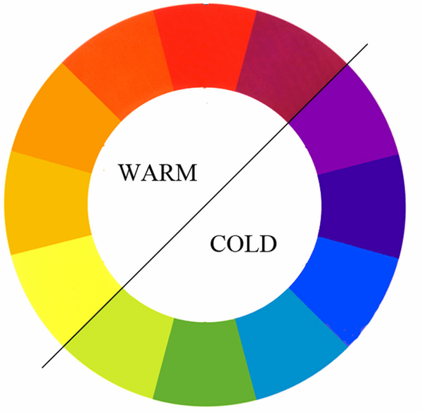
The first order of business is to understand the theory behind what makes colors warm and cool. Depending on the temperature of the colors you select you can begin to set a mood. As a general rule of thumb, the color wheel can be split down the middle; reds, oranges, and yellows are warmer colors while blues, purples, and greens are cooler coolers.
If you’re trying to give a strong “summer” feel to a room, you’ll probably want to use strong shades of warmer colors. Alternatively, if you want to give a more relaxing or “winter” vibe, you’ll want to stick to cooler colors.
The saturation of a color allows you to tone down the brightness. This lets you take what would normally be vibrant colors and remove a lot of their pop. This is a great trick for using colors that would normally be too “in your face.”
Now that you understand the basics of warm and cool colors, you’ll need to understand how to mix your color selections: this is called color harmony.
Complimentary Color Scheme
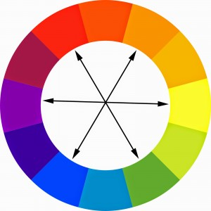 This method of color and design uses colors that are opposite each other on the color wheel.
Because these colors are directly opposite each other, they clash intensely when used in full saturation. Complementary colors can be incredibly jarring when used across a large area, but they work incredibly well if you want a certain element of a room to stand out against a different element.
Analogous Color Scheme
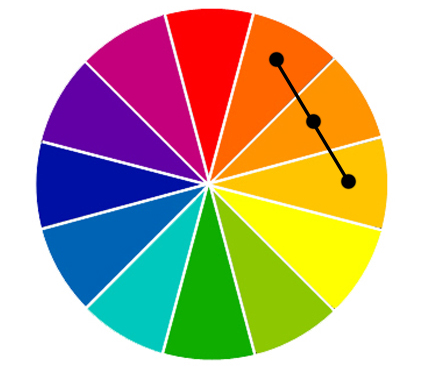 This method of color and design uses colors that are directly next to each other on the color wheel. As you change one color, its analogous color schemes shift with it, allowing you to create harmonious color pallets easily.
Be careful with using an analogous scheme in perfect equals. The colors will blend into each other and you’ll be left without any real sense of direction. Instead, select one color to be the primary, with another color or two to accent it.
Split Color Scheme
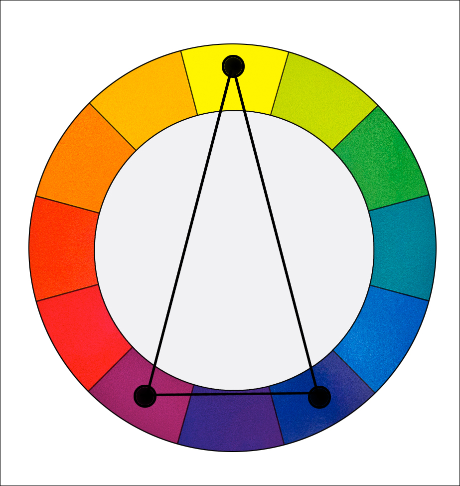 You can find a color split by selecting a primary, then find the two colors sitting next to its complementary color.
Creating a split color scheme allows you to tone down a complementary scheme but still have incredible pops of color.
Tetradic Color Scheme
 This method of color and design uses two pairs of complementary colors.
The sky’s the limit with the possibilities of a tetradic color scheme. We recommend that you allow one color to be a strong primary, with the other three colors accenting it. If you’re going for a powerful expression of color, you can use two primary colors and accent each with their complementary.
Monochromatic Color Scheme
 This method of color and design uses different hues of one color (hue is mixing white with a color to make it lighter than the original color. Don’t confuse this with shade, where you mix black with a color to make it darker).
Monochrome is perfect when you have a favorite color that you want to use in a room. Find a couple hues of that color and go to town.
Achromatic Color Scheme
 This method of color and design uses black and white and adds greys as complimentary colors. It’s hard to go wrong with this color scheme because it’s so easy to implement.